New Depths
How we established a new elevation standard and started thinking beyond drop shadows at Driveway.
What is Elevation?
A flat environment, like a web browser, only has two dimensions – horizontal positioning (x-axis) and vertical positioning (y-axis). These are clearly and naturally depicted while the third dimension, depth, is only hypothetical. When designers apply layer effects, like drop shadows, it allows us to visually suggest a third position (z-axis) despite the flatness of the screen.
Elevation refers to an element’s relative position along the z-axis of an interface. Thoughtfully designed and executed elevation helps the designer and the user in a number of powerful ways.
Improved Visual Clarity
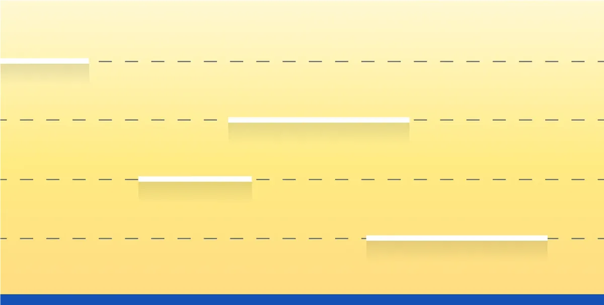
The formal benefit of adding a subtle drop shadow is clear – it can define a visual boundary without adding extra design “stuff” like strokes and fills. However, the real magic of drop shadows is unlocked when they are implemented in a dynamic UI context.

If you’re like me, your computer screen is plastered with open windows. If the shadows vanished from the edges of every open window on my desktop I’d have a difficult time understanding parsing the information on screen. Even if they were differentiated borders or clear contrasting colors, it would be challenging to discern the boundaries of many overlapping-yet-segregated windows.
Conveying Affordance
At Driveway, we do our best to be intentional with our design decisions. Elevating elements is no exception, and there is usually good reason as to why we’d implement it in a design.

It may be a temporary surface, like a dropdown or tooltip. It could also be implemented where the order of layered UI elements is very important. Say, a sticky header on a scrolling page.
The important thing is that we are helping the user understand the relationship between these elevated elements to the rest of the viewport.
Improved Accessibility
Clarity and affordance both underpin accessibility. By developing visual tools like thoughtful elevation, we can help users make clearer sense of the environment we’re presenting – heightening the likelihood that users can easily navigate the z-index.
Improving Our Elevation System
While our legacy UI implemented drop shadows, the established selection was limited to only two values. We assumed this decision was made in effort to make things easier for designers – fewer options = less mental burden.

We also noted that the shadows were very light – imperceptible under certain conditions and not very different from one another. Perhaps the intention here was to lean into subtlety, avoiding the chance of muddy or heavy-handed shadows.
With respect to past decisions, the current needs required clear implementation guidelines that would scale with our product and it was evident that two near-similar options would not be enough to build them. If a truly comprehensive elevation system were to be achieved, we had to start from square one.
Just a note – while I’m numbering the steps below, much of the work I’m detailing had to be done in parallel. There isn’t a single right way to define elevation, but we did identify a few high-value priorities worth, uhh, elevating 😒.
Step 1: Improve Shadow Quality
Each legacy elevation value relied on a single box-shadow, an approach that presents a few formal design challenges. If the shadow is offset from its element, one edge of the element will often lose its edge against a similarly colors backdrop. If the shadow is set too close to its element, it can appear muddy and less elevated.

Rather than illustrate depth with a single drop shadow, we took a page from Google’s Material UI and layered three distinct box-shadow values for each stop on our elevation scale.
The result is a crisper and more nuanced depth effect. It also got us thinking differently about how we talk about elevation values. Rather that ranking elevation by how light or dark it appears, could we rank by perceived depth? This may seem obvious, but we realized intentionally looking beyond the visual aesthetics helped us keep the whole interactive space in mind when we broadened the scale.
Step 2: Broaden the Elevation Scale
We also had to determine how many elevation values were necessary and how they would track along a linear scale.

Four to six elevation stops felt like enough to provide flexibility without introducing too much complexity for designers. We looked to Material UI once again and utilized thier 0 to 24 dp range to define our stops. This helped us continue our efforts to step away from a superficial “light vs. dark” model.
Step 3: Give Them Jobs
To me, this is the most exciting part of developing a new set of guidelines. It’s easy enough to make a family of attractive drop shadows, but assembling a playbook around how and when those shadows should be implemented presents some exciting challenges.
The reason the previous set of values was limited was for safety – shadows can be misused and abused. Additionally, designers may have felt paralyzed by too many options and no prescriptive instructions. By writing coherent and easy-to-follow usage guidelines around our elevation values we can avoid this issue. If we’re crafty with our words, we can do so while staying flexible for future interpretation.

Conclusion
By addressing elevation’s “why” and “how” we were able to assemble a comprehensive approach for our designers.
The best solutions are the ones that solve multiple problems. While this work was prompted by visual design concerns, we also managed to devise a solution that addressed accessibility, scalability, and implementation. ❖