What Goes Into Developing Design Principles
Organically articulating design principles that are authentic and meaningful takes patience.

As designers, our penchant for thoughtfulness and passion can sometimes backfire. We tend to overthink things to the point where it hinders actual progress. This manifests in various ways.
For example, we can get so swept up in crafting a solution that we lose sight of the problem that originated it. Unsurprisingly, this poses significant prioritization and scope management challenges. The irony is that if we do not rein in these tendencies, all of that thoughtfulness and passion may result in a not-so-great user experience.
We're a passionate bunch at Driveway, and, admittedly, we run into analysis paralysis time and again. But rather than scold ourselves for it, we saw an opportunity to tackle the issue while staying true our commitment to good user experience via design principles.
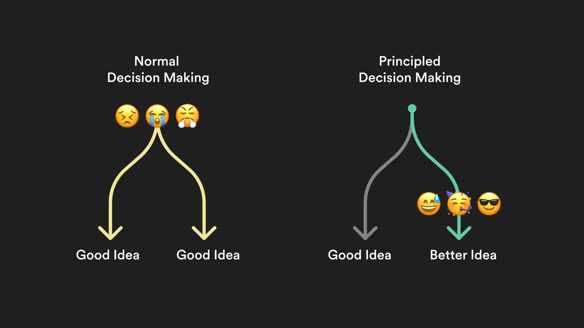
If that seems like a long walk, read this quote from Nielsen Norman Group (emphasis mine).
“When successfully composed and used, design principles ensure consistency in decision making across designers and teams, removing the need to debate simple tradeoffs and letting designers worry about complex problems.”
Worded thoughtfully, design principles can be a north star while also providing practical in-the-trenches guidance for teams. For example, if an individual was confronted with two comparable solutions, at least one stated principle should help nudge them in one direction over the other.
Put graphically...
Where do you start?
Although the organization had established values, beliefs, and a mission statement, the absence of codified Design Principles was apparent. Some may question whether values or beliefs suffice for the task at hand. I would argue no. Design Principles are tailored to the attributes present in the work itself. While these qualities may reflect broader factors like culture or brand identity, they must provide objective guidance.
Our goal to develop three to five design principles from zero started with a set of key priorities in mind:
- Brand: Driveway's brand statement is to “provide users with a comfortable online car buying experience.” But it's crucial to recognize that comfort isn't static. It's profoundly subjective and shaped by individual perspectives, expectations, and life circumstances.
- Utility: Useful design principles must transcend feel-good platitudes and function as actionable guides throughout the design process.
- Authenticity: Ensuring that these principles authentically reflect the ethos of the entire organization is paramount. They should not serve as a vanity project for designers but resonate with the values of the organization as a whole.
Step One: Who do you think you are?
The team shared a hunch that we all shared similar convictions around what made a comfortable online car-buying experience – down-to-earth language, airy layout, clear flows, and accessible design to name a few.
It felt like we were operating on the same page, we just hadn’t put what we were doing into words yet. We decided to let that hunch inform our first discovery exercise. We needed a “vibe check”.
Exercise: The Dinner Party
We delivered the following prompt to 25 product and content designers:
“Imagine you’re at a dinner party along with a handful of people you don’t know. The drinks are flowing and the conversation is lively. Driveway is one of the people you’re meeting for the first time.
What words would you use to describe this person?”
We provided a link to a Whimsical board, where everyone added their descriptors. In the following days, we began to roughly cluster terms by theme while also taking note of any that had been mentioned multiple times.

Several themes arose. Many entries related to openness and honesty with repeated terms like “approachable,” “welcoming,” and “good listener.” We also had a surprising number of entries relating to what I’d call coolness, with “stylish” being mentioned a number of times along with adjacent terms like “casual,” “charming,” and “confident.”
There were a couple of outliers, but nothing too wild. The exercise seemed to confirm the hunch that we shared a unified vision, albeit nebulous.
But is it what the users want?
We might feel confident about who we are or who we’d like to be, but it would be irresponsible to embrace those characteristics without checking it against the needs of users. We had a user-centered mission and we needed to read the room.
Conveniently, other team members had recently performed user research centered around our written voice and tone, dovetailing nicely into the Dinner Party thought experiment.
We learned that while user's may appreciate a “cool” or “fun” voice when beginning their vehicle search, that voice may be less-welcome if they've encountered an error or, worse, their financing has been denied.
This seems obvious in retrospect, but it opened our eyes to nuance required when articulating these characteristics. From our perspective, there was no way to thread this needle except by being extremely thoughtful with our language and packaging of these principles, which is what determined the subsequent steps.
Step Two: Identify Clusters
Entering this process, we were clear on our objective: to distill three to five overarching principles, each accompanied by a detailed description. At this point, in my mind, I was imagining the terms we had collected along with others, vibrating and clumping together like cells under a microscope – somehow arranging themselves into distinct-yet-complementary groups.
Alas, that would not happen. We promptly convened another workshop to explore strategies for organizing these concepts into clusters to get us closer to our goal.
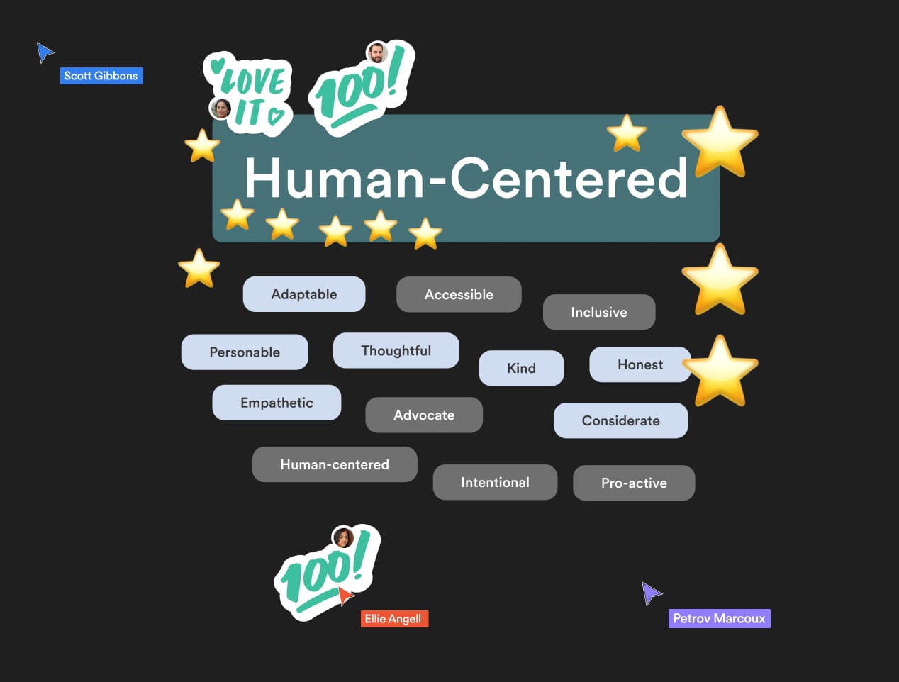
Exercise: Card Sorting
For focused and diverse results, we assembled a group of about twelve product and content designers, of whom we divided into three teams. Each team was given a Figma template preloaded with terms collected from the previous exercise.
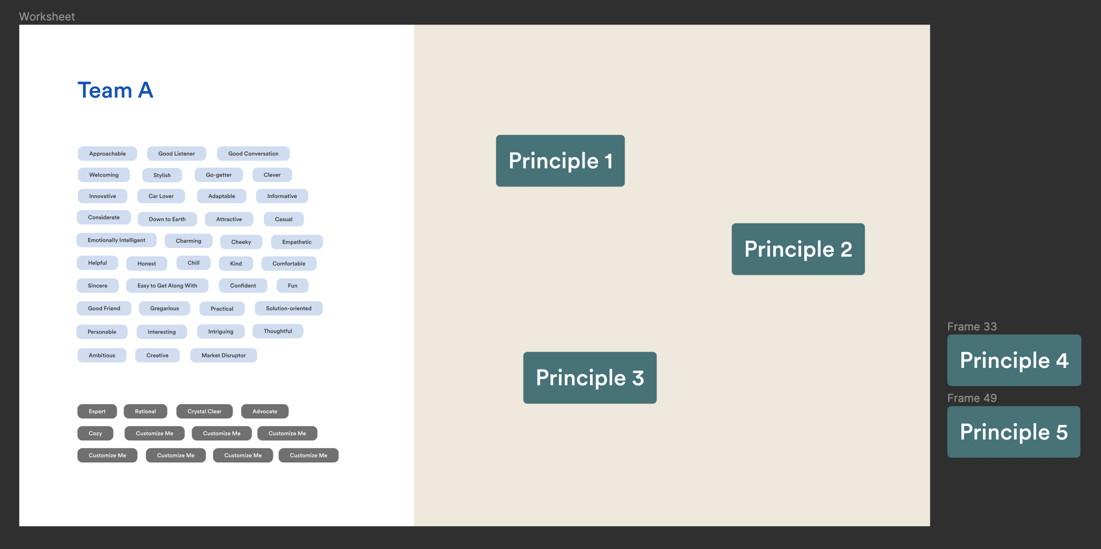
Teams worked privately for ten minutes, empowered to freely transfer terms from the left column to the right, while also changing the “Principle” headline text to reflect whatever themes that emerged. Additionally, they had the liberty to craft new terms as needed. Once the allotted time elapsed, everyone regrouped to showcase progress, then engaging in silent voting and feedback.
Excitingly, numerous promising trends began to surface.
Step Three: Synthesis
Then came the hard part where I hunkered down with my Design System content counterpart and went through iteration after iteration of the written principles. After each round we hosted a group critique, inviting team members to poke holes and make suggestions.
We hosted three sessions – each with a different critique group. While grueling, it was enlightening to learn the many ways words can (and will) be interpreted differently – a similar realization to our early user research discoveries.
For example, in one draft we titled a principle “Purposeful”, considering it a relatively unbiased term signaling intention and function. However, people had wildly different concepts of what it should mean. For example, "purpose" could also signify something personally meaningful. The meaning could also shift depending on whether you were looking at it from the perspective of the designer versus the user. So, not only did we need to refactor semantics, but framing had to be considered as well.
The Results
We settled on principles that were conversational and tone-driven rather than focus them around specific words. We found it helpful to attach “related terms” to each since certain terminology is significant to Driveway's mission and values, such as “transparency”, “empathy”, and “approachability”.
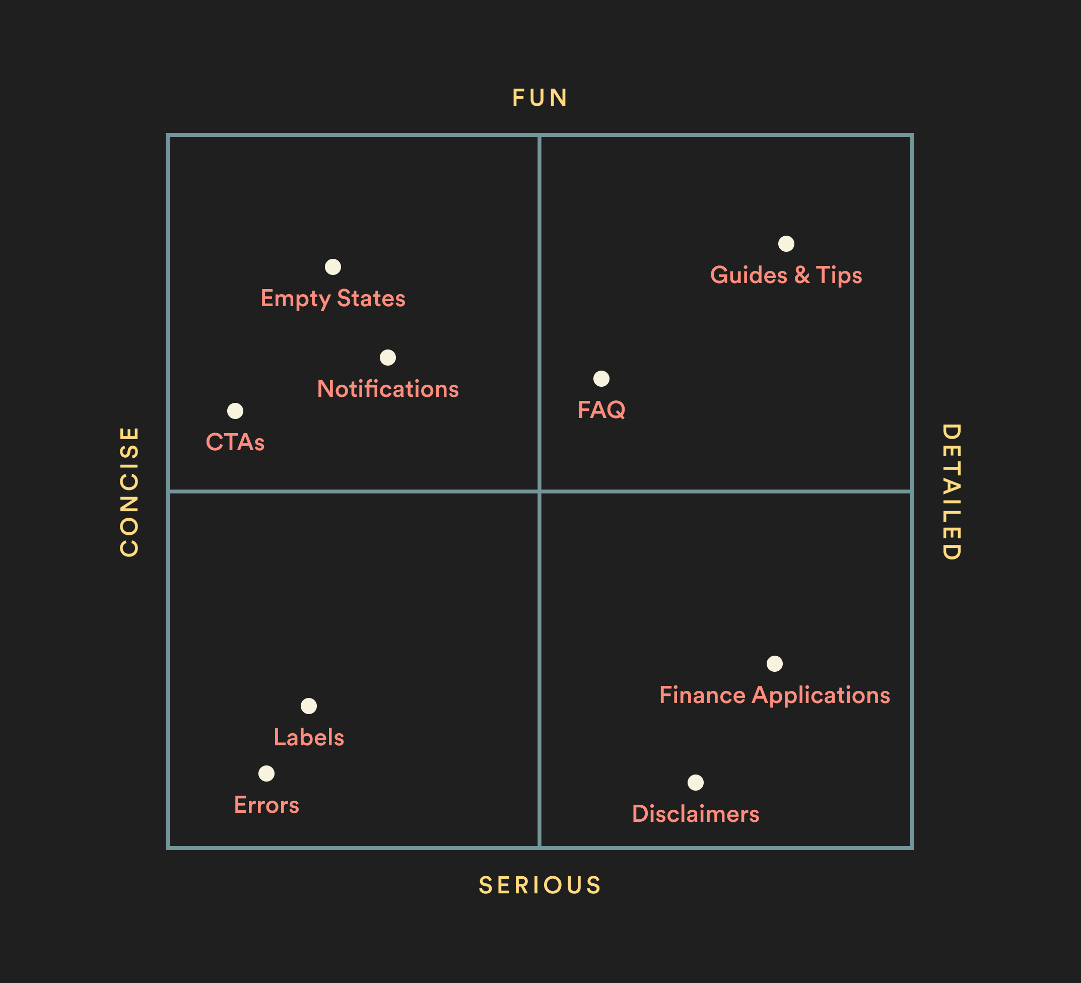
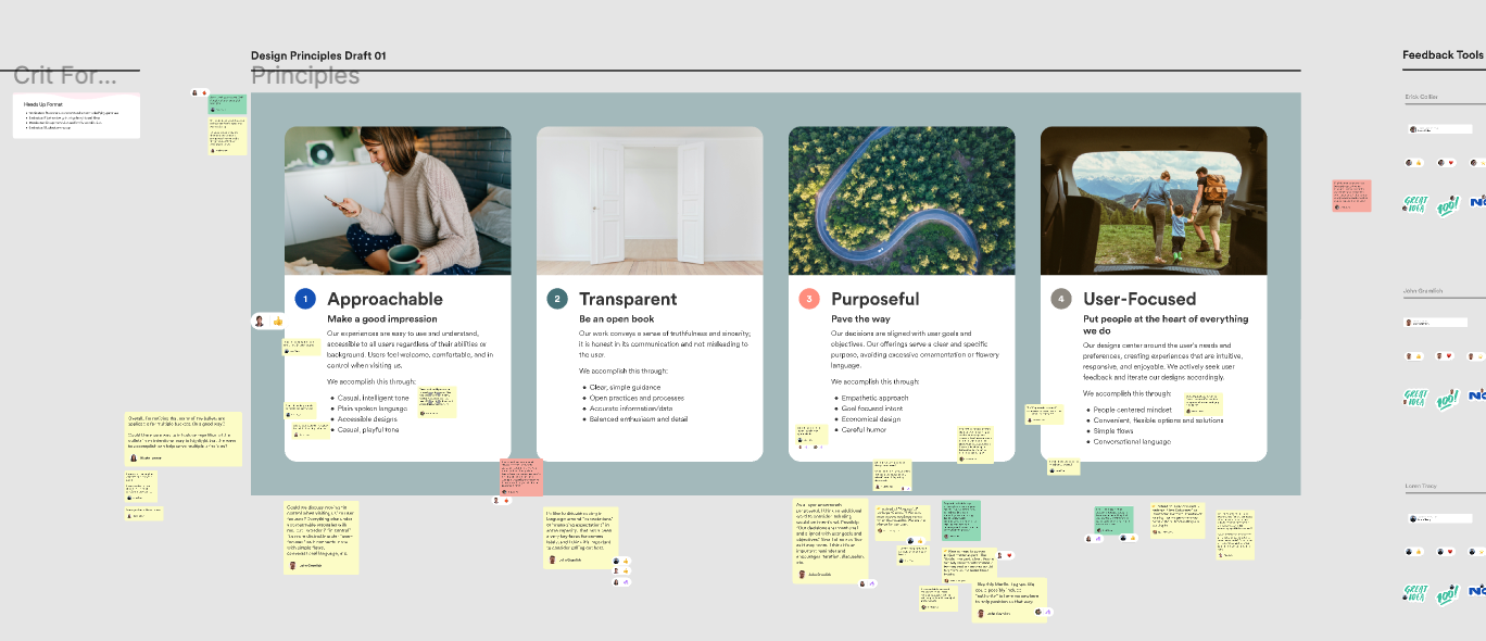
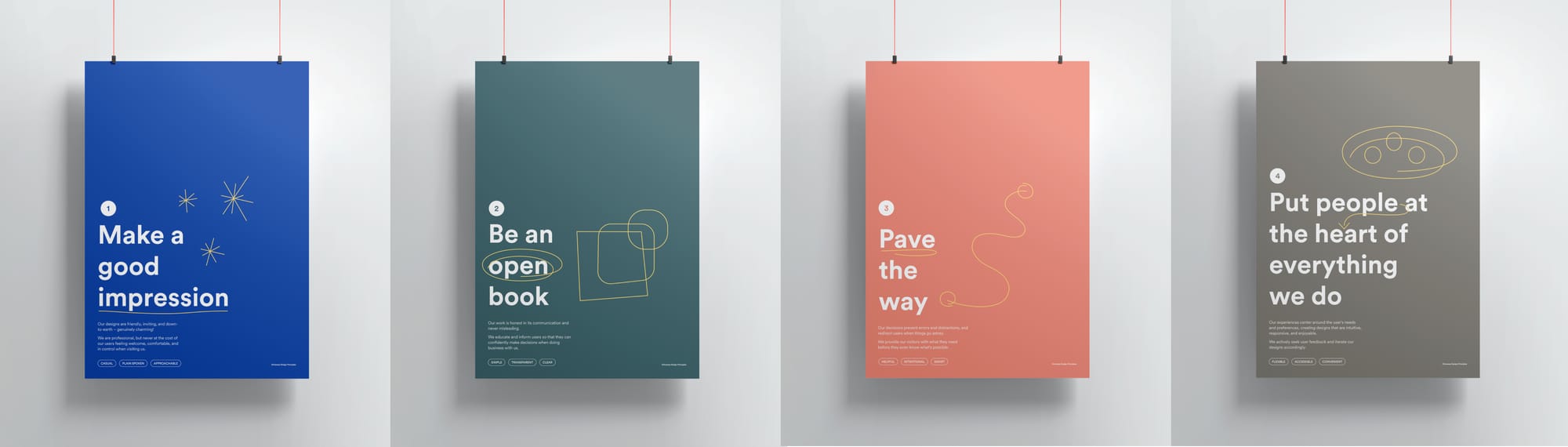
The final four principles represented visally
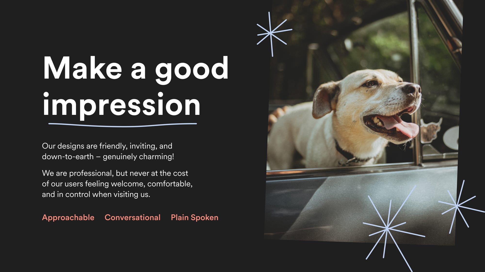
Principle 1: Make a good impression
Our designs are friendly, inviting, and down-to-earth – genuinely charming!
We are professional, but never at the cost of our users feeling welcome, comfortable, and in control when visiting us.
Related terms: Approachable, Conversational, Plain Spoken
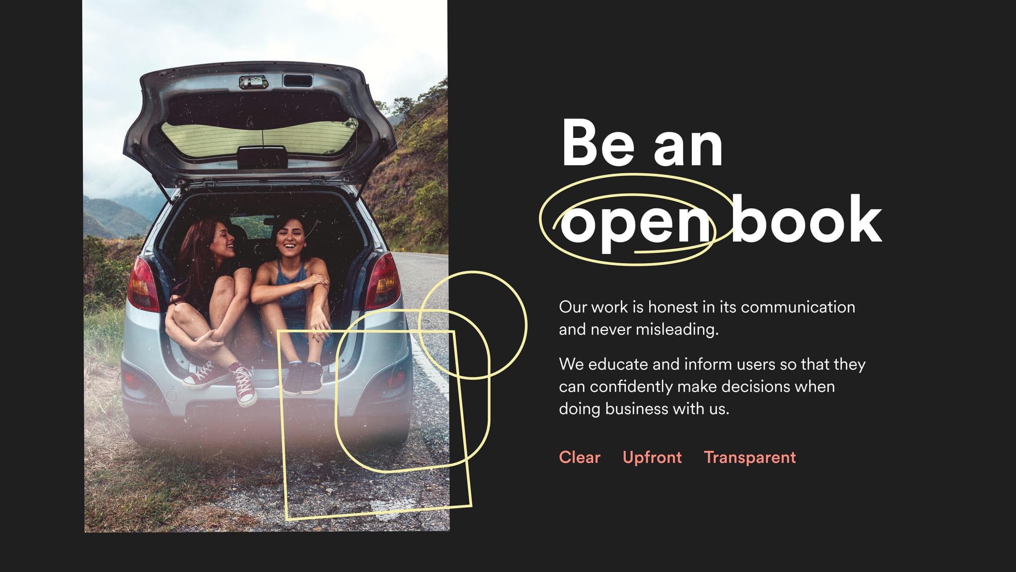
Principle 2: Be an open book
Our work is honest in its communication and never misleading.
We educate and inform users so that they can confidently make decisions when doing business with us.
Related terms: Clear, Upfront, Transparent
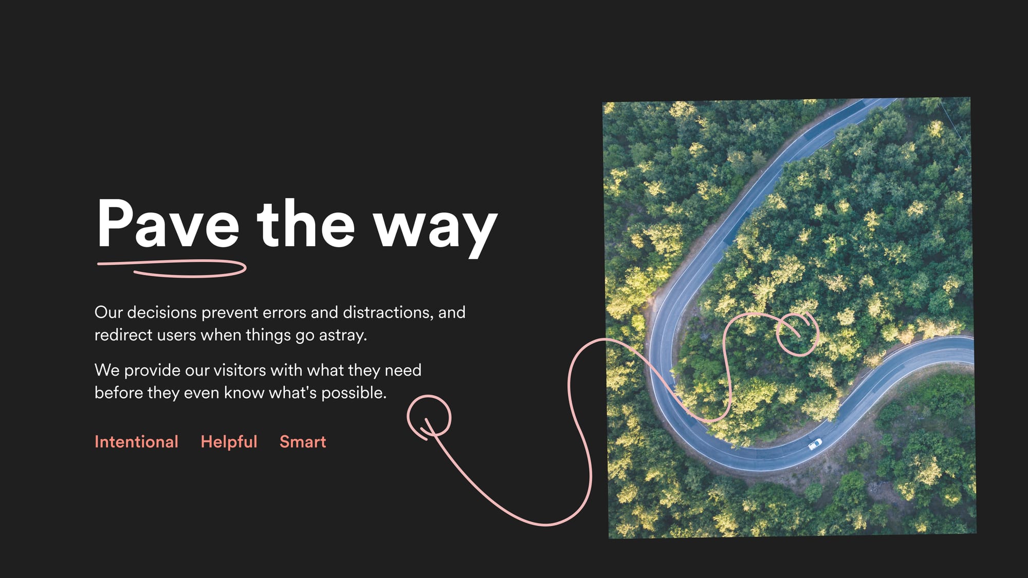
Principle 3: Pave the way
Our decisions prevent errors and distractions, and redirect users when things go astray.
We provide our visitors with what they need before they even know what's possible.
Related terms: Intentional, Helpful, Smart
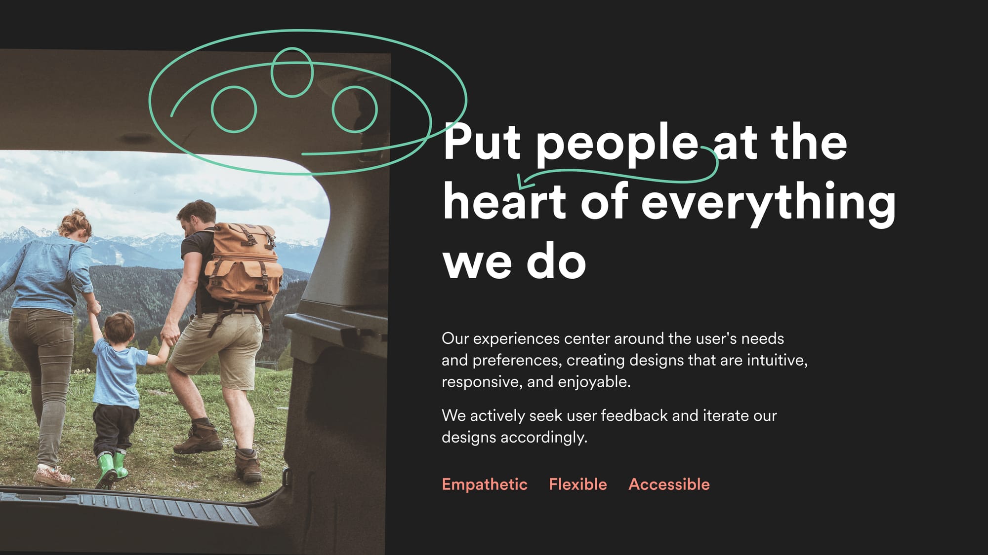
Principle 4: Put people at the heart of everything we do
Our experiences center around the user's needs and preferences, creating designs that are intuitive, responsive, and enjoyable.
We actively seek user feedback and iterate our designs accordingly.
Related terms: Empathetic, Flexible, Accessible
Your Work's Not Over Yet
My suggestion to anyone who has gotten this far is, before unveiling your your hard work to leadership or team, get a few more ducks in order.
You'll undoubtedly receive praise for your work, as Design Principles are an exciting, morale-boosting accomplishment. But the excitement will eventually subside and you will need mechanisms that will keep the organization engaged on multiple fronts.
I'm Not Talking About SWAG
Sure, you can print SWAG. But stickers and notebooks don't actually help anyone. Moreover, they burden the environment and exploit low-wage workers – gross! There are a number of better, low-effort, and higher-impact ways to engage your team for the long term.
Documentation
When taken seriously, Design Principles can be a highly influential part of an organization's identity. This is you're chance to make a your mark – I'm not kidding!
If your organization is predominantly made up on non-designers, I'd recommend creating versions aligning with whatever format or context that will get it seen by as regularly by as many eyeballs as possible.
Post your Design Principles some place high level. Strategically crosslink back to them in multiple places throughout. Here are a few ideas to start...
- Employee Onboarding Docs: An integral piece of the onboarding toolkit for new hires and contractors
- Vendor Agreement Docs: Speeds up the get-to-know-us process if your organization works often with third parties
- Other Team Docs: I can't understate how frequently our principles get cited by other teams, including brand, content, even c-suite.
Integrate It Into Your Process
Think about the checks and balances that pop up throughout your process – Who are we solving for? Is this accessible? Does so-and-so need to sign off on this?
You probably do. These checks may be formal or ad hoc. Regardless, consider adding Design Principles to the list and be certain that your output remains above board.
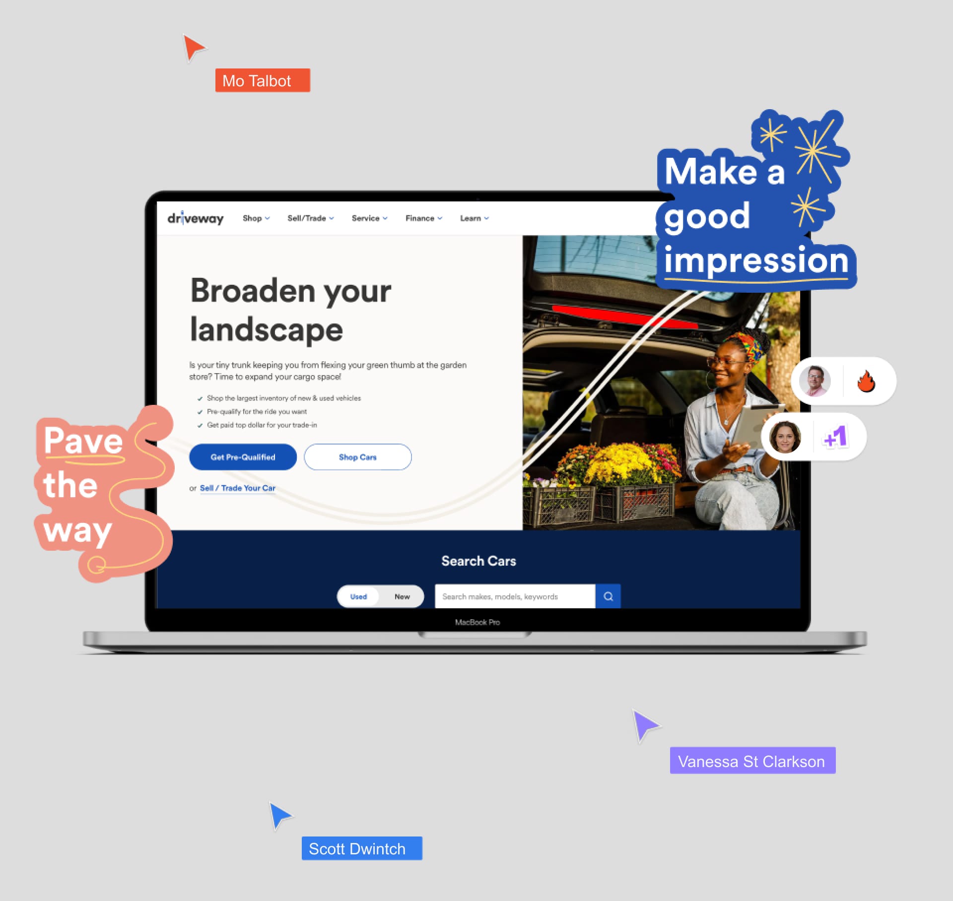
At Driveway, we published a Design Principles “sticker pack”, which exists within our shared Designer Toolkit library. This allows designers to easily reference a principle alongside notes, feedback, or praise.
OK, Maybe a Little SWAG

Digital SWAG is a fun, low-cost way to drum up excitement, especially if your team is distributed. Animated GIFs are supported in Figma now and they're good to toss into a Slack channel now and then. If a GIFs are too labor-intense for you, convert your presentation slides into desktop backgrounds and share them with everyone on the team.
In Closing
Part of me is compelled to apologize for how verbose this post is, considering how punchy and succinct the end product is. However, I'd be remiss if I did not spend time retracing the steps necessary to where they brought us.
Hopefully some of you may find it helpful. ❖